UX/UI Design · Bilwebben · UX/UI design and design system
Redesigning a marketplace for car buyers and car dealers
As the sole UX/UI designer, working directly with the founder and the developers, I redesigned how people find a vehicle on Bilwebben and decide on it, from user flows to finished UI for desktop and mobile. I also built the design system behind it.
- My role
- UX/UI designer
- Team
- Founder and developers
- Platform
- Web, desktop and mobile
- Tools
- Figma
- Status
- Design delivered, not yet live when I left
- Period
- 3 months, spread over 2025–2026
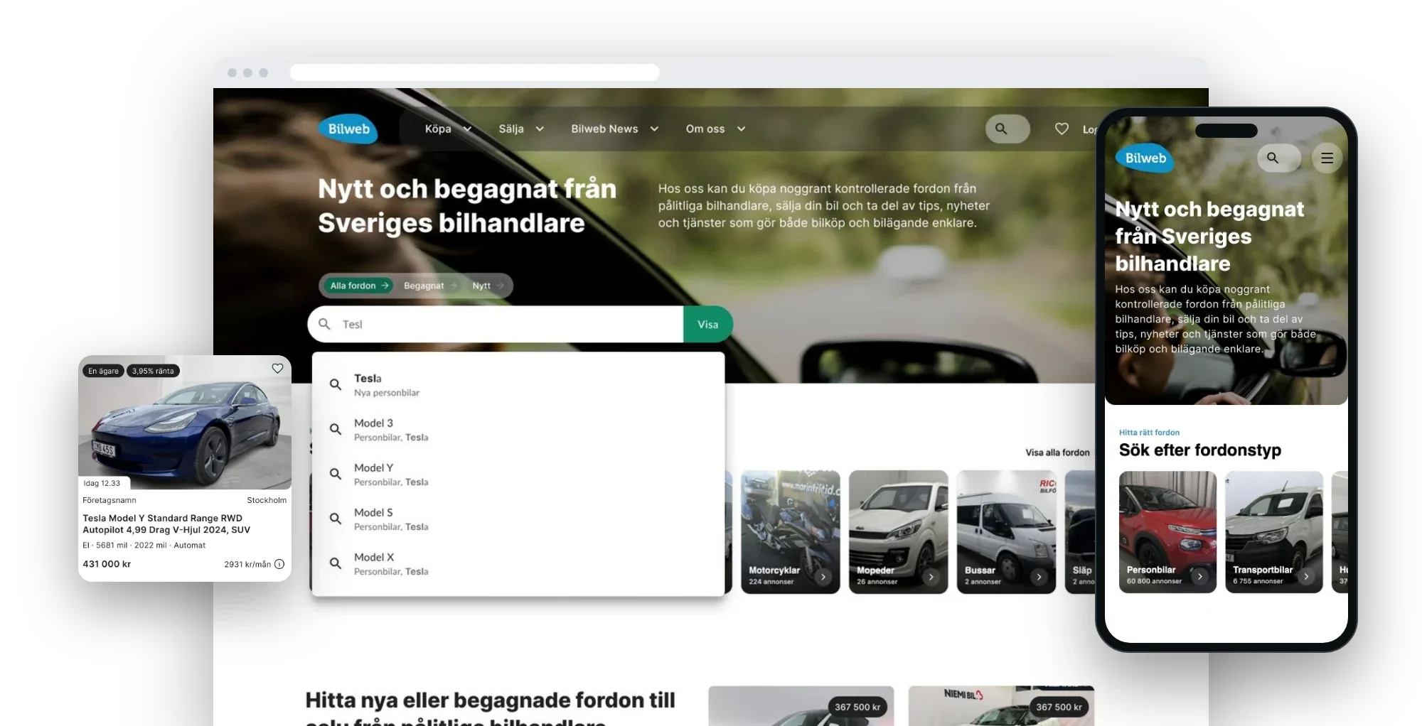
The short version
The challenge
Bilwebben gathers new and used vehicles from dealers across Sweden. With that many listings, buyers had two problems: finding the right vehicle, and feeling sure enough to act on it. On top of that, the interface had become dated.
What I did
I followed the buyer's journey from the first search to contacting a dealer, and redesigned each step, from structure and flows to finished UI. I also designed new services and the logged-in experience, and owned the design system behind it all.
What I delivered
A clearer marketplace design, ready for development. Getting a loan for your next car, reading the news and configuring a brand-new car are designed as part of the site, not as separate partner pages. I left the assignment before the new site went live.
What I did as UX/UI designer
UX and information architecture
I followed the buyer’s journey and restructured the start page, search, filters and listing page around it.
UI design for desktop and mobile
Finished screens in Figma for both, from the start page to the loan application.
Interaction design for longer flows
Steppers, summaries and forms that show where you are, what is done and what is left.
Design system
Colour, type and elevation as variables, and components for desktop and mobile with accessibility built in.
Partner services on our own terms
I designed the car loan application on the partner’s API, in place of the partner’s form in an iframe.
Close work with developers
Components have the same names in Figma as in code, so design and build stayed in step.
Understanding buyers
Before changing any screens, I needed to know how people actually look for a vehicle: what they know when they arrive, what they look for, and where they get stuck.
User testing was not a priority in the project, but I needed to check my own concerns before redesigning. So I ran some quick tests with users, focused on search and filtering, and did my own UX review of the whole site. Four things stood out.
Search went unnoticed
People did not find the search at all, so nobody used the quickest way to a vehicle.
Filters were hidden and thin
Filtering was hard to find, and once found, it offered too few options to narrow down a large number of listings.
Longer flows gave no overview
Configuring a new car and applying for a car loan did not show the steps ahead, so people could not tell where they were or how much was left.
Partner flows in iframes were hard to follow
Partner services sat in iframes. They looked and behaved differently from the rest of the site, which made them hard to understand.
The last two findings gave me the room to work with the partners’ APIs instead of iframes, so that we could design those flows ourselves.
From here the work had two aims: help people find a vehicle, and help them feel sure enough to act. The next two chapters take them in turn.
From search to shortlist
Finding a vehicle starts with search. I reworked the start page, the search and the filters, so that people can get from tens of thousands of listings to a shortlist they trust.
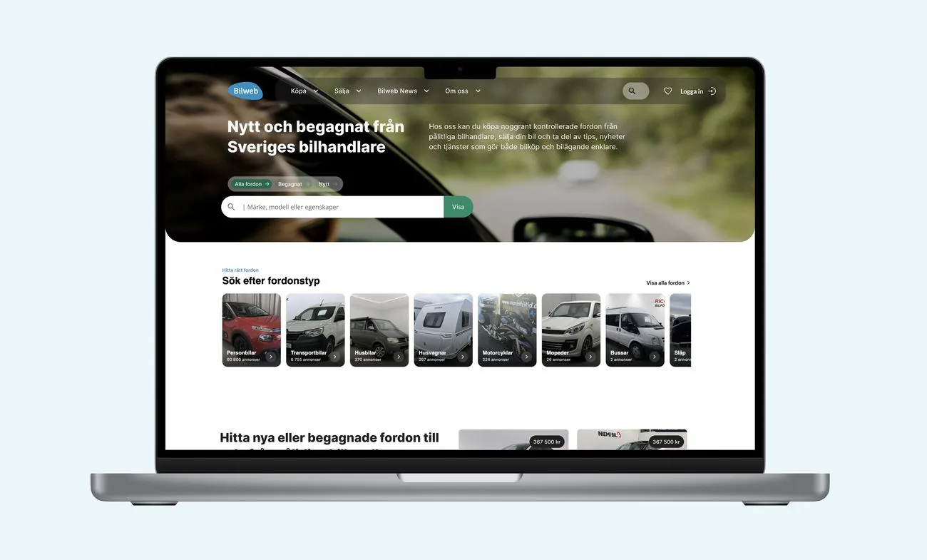
- A focused search for vehiclesThe start page opens with one field for make, model or features, made for finding vehicles for sale. It suggests makes and models as you type.
- A global search in the menuA second search sits in the top menu, within reach from every page.
- All, used or new in one tapThe first choice a buyer makes sits right above the search field.
- Browse by vehicle typeCars, vans, motorhomes, caravans and motorcycles, each with its number of listings, for people who are still looking around.
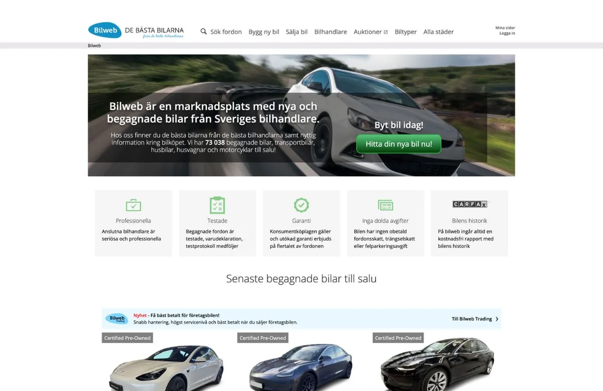
- Search is a small link in the menu.
- The banner has one button and no search field.
- Five boxes of selling points, and no way to narrow down from here.
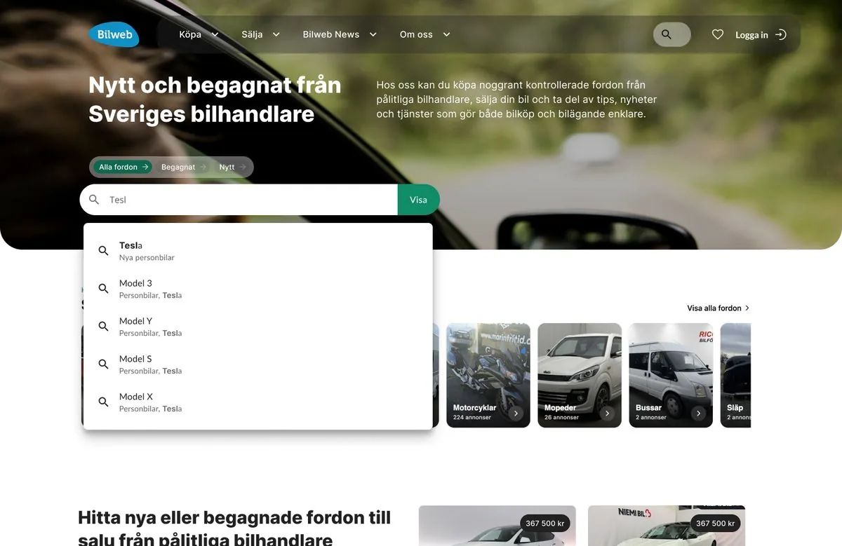
- A search for vehicles in the middle of the page.
- All, used or new, right above it.
- Makes and models suggested as you type.
- The global search stays in the menu.
Insight: one way in to search was not enough
I first tested a version where the global search was the only way to search. The final design combines two: the global search, and a focused search on the start page for finding vehicles for sale.
What the test showed
With only the global search, the way to a vehicle was a small icon in the menu. That was not enough for people who had come to find one.
Why I added the focused search
Finding a vehicle is the main thing people come to do, so it got its own search in the middle of the start page. The global search stays in the menu for everything else.
Results, suggestions and filters
The same thinking carries on after the start page. Click an image to enlarge it.


Deciding with confidence
Finding a vehicle is only half the job. The other half is feeling sure enough to act. That takes three things: details you can trust, a dealer you can trust, and a clear next step.
Details you can trust
- Photos first, with a countA large photo with arrows, thumbnails beside it and a counter such as 13 of 35, so buyers know how much there is to see.
- Facts in sections you open when you need themSeven sections, from vehicle information to equipment, keep the page short. Each opens into a plain grid of labelled facts, so a buyer can check one thing without reading everything.
- The vehicle's history, before you have to askA card says how many events are on record and what the report covers: damage, owners, inspection and mileage. It is free through Bilweb, and one button opens it.
A dealer you can trust
- The dealer card stays with youThe dealer's name and town, the price and when the listing was updated sit in one card that stays in view while you scroll.
- See who you are dealing withThe contact window opens out to show the dealer's address, a map, directions and a link to the rest of their stock.
A clear next step
- One main action, one quick alternativeA green button to contact the dealer, with "Call us" underneath. Clicking it shows the phone number right there.
- Choose how you want to be contactedEmail, a call back, a test drive, a price for your trade-in or a bid: five options in one window, then a short form that asks only for what that choice needs.
- Monthly cost next to the priceA link to work out the monthly cost sits right beside the price, which is where the question comes up.
Partner services that belong on the page
- One card pattern for every partnerInsurance and loan offers use the same card as the vehicle history: a short label, the partner's logo, a few benefits and one button. Each keeps its partner's colour, so it is clear who is behind the offer.
- Written for this exact vehicleEach offer names the car you are looking at, so it reads as help with this purchase and not as an advert.
The whole journey on mobile
Every step was designed for the phone as well as for desktop. Click a screen to enlarge it.


Applying for a car loan
Car loans on Bilwebben come from a partner. The quick way to offer them is to place the partner’s form on the page in an iframe. I was given the room to design our own application on the partner’s API instead. Here are the two side by side.
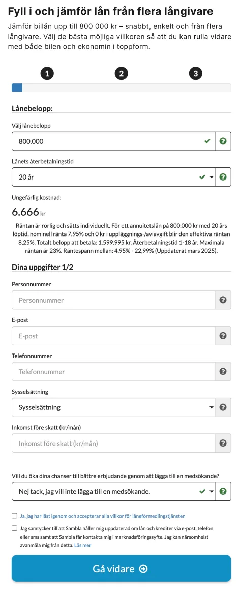
- Three numbered dots, with no names.
- Loan details and personal details in one long column.
- The partner’s own fields, help icons and blue button.
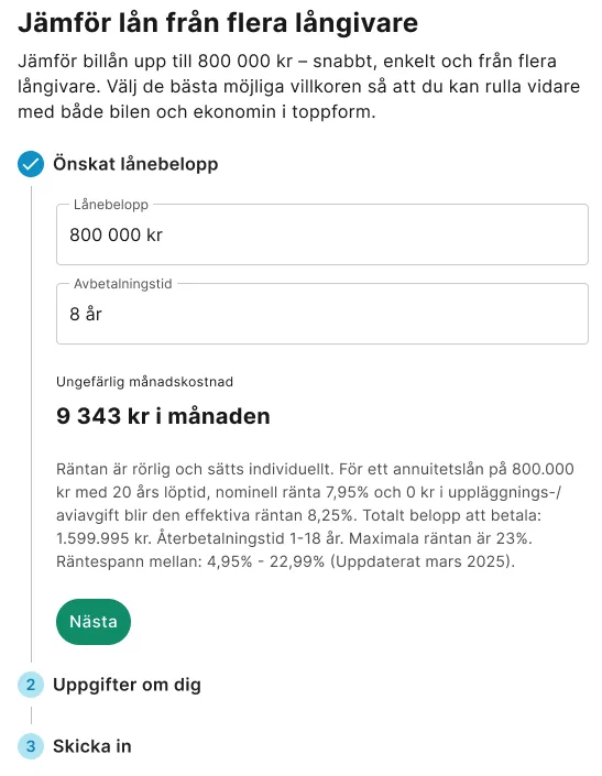
- Named steps, and only this one open.
- The monthly cost, large and in plain words.
- The site’s own green button.
- The steps still to come.
- Three named steps, one open at a timeDesired loan amount, About you, Send. People can see the whole application before they start, and only deal with one part at a time.
- Finished steps fold into a summaryA completed step becomes one line, such as “343 000 kr, 8 years”, with a pencil to go back and change it.
- The site’s own fields and buttonsThe form uses the same inputs, type and green buttons as the rest of Bilwebben, so applying no longer feels like leaving the site.
- Questions that explain themselvesAdding a co-applicant comes with a short reason and two buttons, in place of a dropdown and a help icon.
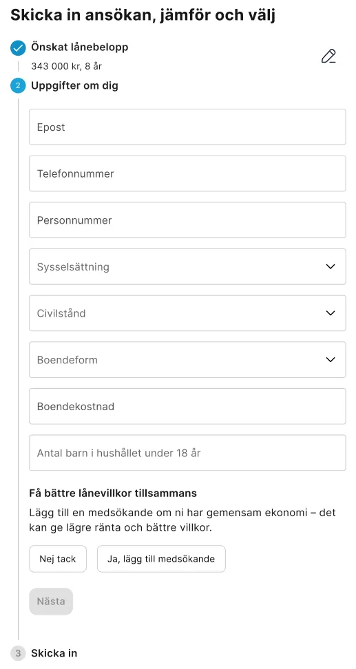
- Step one, folded into one line with a pencil to edit it.
- The co-applicant question, with a reason and two buttons.
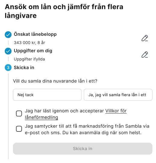
- Both earlier steps are summaries now.
- One last question, then two consents and the button.
New services, same system
Bilwebben grew during the work. New services and pages were added, and each had to feel like part of the same marketplace. I designed them from the same components as the rest of the site.


Design system
I was responsible for the design system. It keeps Bilwebben consistent across desktop and mobile, and lets new pages be built from the same parts.
- Blue#1190C6Brand, links
- Green#108C69Main actions
- Dark#141B34Dark surfaces
- Grey 900#212121Text
- Blue 50#E9F6FBSoft surface
- Green 50#EAF7F4Soft surface
- Grey 100#F5F5F5Background
- Heading 232 · Semi Bold
- Nytt och begagnat från Sveriges bilhandlare
- Heading 324 · Bold
- Sök efter fordonstyp
- Heading 420 · Semi Bold
- Dags att byta bil?
- Subtitle16 · Semi Bold
- Riddermark Bil – Megastore
- Body16 · Regular
- Hos oss kan du köpa noggrant kontrollerade fordon från pålitliga bilhandlare.
- Body small14 · Regular
- Räkna ut priset för din Volvo XC60.
- Caption12 · Regular
- 60 800 annonser
- Button15 · Medium
- Visa alla bilannonser


- Why it was neededThe interface had become dated, and the site was growing. Designing each page on its own would not have held together.
- What it containsColour, type and elevation as shared variables in Figma, and components for the whole journey: navigation, search, filter chips, vehicle cards, partner cards, accordions, steppers, bottom sheets and buttons, for both desktop and mobile.
- Accessibility built inAccessibility was built into the components, so every page made from them starts from the same accessible base.
- How the team used itComponents have the same names in Figma as in code, such as Button, Accordion and CardActions, so the founder, the developers and I were always talking about the same thing.
What I took with me
I would start with a design system again. It gave every page the same foundation, from search to the loan pages.
I encouraged the team to set measurable outcomes for the changes we made, but it never got the focus it needed, and I left the assignment before the new site went live. That is why this case has no numbers to show. Next time I would agree on what to measure before the first design is built.
What I would change is the tooling. Today I would set up the design system and the first draft in Figma, then continue the design work in Claude. There the design is a working web page: it adapts to any screen, people can try it on their own phone, and the developers get something close to what they will build.