UX/UI Design · TRR · Senior UX design, from research to development-ready
How we increased the use of the match profile and improved job matching
As senior UX designer, I took TRR’s match profile from research to development-ready design. A clearer and more guiding flow made the profile easier to discover, create and keep up to date, with personal suggestions, relevant reminders and a broader matching logic. The share of users with a match profile rose from 30 to 50 percent.
- My role
- Senior UX designer
- Year
- 2024
- Industry
- Career transition and working-life services
- Company
- TRR
- Scope
- 3 months
- Platform
- Web, desktop and mobile
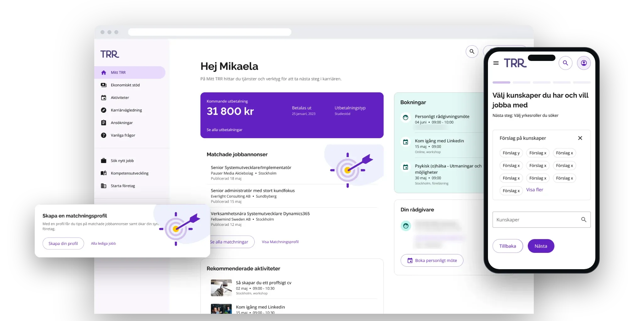
The short version
The problem
Many users did not know they could create a match profile. Those who found it struggled with the criteria, and profiles were rarely updated. That made job matching less accurate.
What I did
As senior UX designer, I was responsible for the UX design through the whole initiative, from research and analysis to concept, prototype and development-ready design for desktop and mobile.
What changed
The share of users with a match profile rose from 30 to 50 percent, and the share of complete profiles from 80 to 93 percent.
What I did as senior UX designer
UX research
User interviews, surveys and behavioural data, mapped to a user journey that showed where people lost understanding or motivation.
Flow and interaction design
Five short steps, one question per page, with a progress bar and the next step named, so the user always knows what is done and what is left.
UI design for desktop and mobile
Finished screens in Figma for both, built from the components in TRR’s design system.
States and edge cases
Each step drawn in every state: with and without suggestions, with choices made, with an error and in edit mode.
Development-ready handoff
Design specifications the developers built from, and design reviews during implementation.
A measured result
30 to 50 percent of users with a match profile, and 80 to 93 percent complete profiles.
The problem
Research and behavioural data showed that the problem was not only about filling in the profile.
Many did not know it existed
Many users were not aware that they could create a match profile.
The criteria were hard to understand
Those who found the feature often struggled to understand which matching criteria to enter, and what value the profile created.
Profiles were rarely updated
Profiles were seldom updated when a user’s experience, skills or job goals changed.
Incomplete and outdated profiles led to less relevant job suggestions, lower visibility to employers, and a risk that users missed suitable opportunities. It made both the user experience and the accuracy of TRR’s job matching worse.
The design challenge
The central challenge was to make the match profile easier to discover, create and keep up to date, without simplifying away the information that a relevant match needs.
The solution had to help users understand which criteria to choose, explain why the information mattered, and give them a reason to come back when their goals or experience changed.
Guidance without losing control
At the same time, users needed to stay in control of their profile and understand how what they entered affected the job matching.
How I worked
My role
As senior UX designer, I was responsible for the UX design through the whole initiative, from research and analysis to concept development, prototype and development-ready design, and I supported the developers during implementation.
I ran user interviews and surveys, analysed behavioural data and mapped the user journey to find where users lost understanding or motivation. From those insights I made wireframes and prototypes in Figma, tested solutions and refined the flows together with the team.
I took the design all the way to development-ready. I wrote the design specifications the developers built from, did design reviews during implementation, and adapted the solution to the technical conditions without compromising the central user flow.
From research to development-ready design
Interviews, surveys and behavioural data → user journey → wireframes and prototypes in Figma → testing and refining → design specifications → design reviews during implementation.
The team
I worked closely with the product owner and the developers to bring together users’ needs, the goals of the business and the technical conditions.
Research insights, prototypes and design decisions were used as shared material for prioritising and carrying out the work.
Key design decisions
Three insights from the research became three design decisions.
- Make the profile and its value visibleThe match profile got a clearer entry point from the user’s dashboard. We did not only present the feature. We explained what a complete and current profile gives: better job matches and more visibility to employers.
- Give the user a relevant starting pointPersonal suggestions based on the user’s CV and job-search history reduced the uncertainty about which matching criteria to enter. The suggestions worked as support, and the user could still review and change the information.
- Broaden the matching without losing relevanceThe matching logic went from showing only direct hits to also including adjacent matches. That gave users more relevant opportunities without requiring every criterion to match exactly.
The solution
The solution became a clearer and more guiding profile flow that supports the user in three central situations.
- Discovering the match profileAnd understanding its value. A clearer entry point on the dashboard made the feature easier to find.
- Creating a relevant profileWith the support of personal suggestions. The user got help choosing relevant criteria from their CV and job-search history, and could review and change the information.
- Coming back and keeping it currentWhen the profile needed updating, reminders showed what was missing and why it mattered.
The broader matching logic also made it possible to show adjacent jobs, not only direct matches.
Discover: the match profile on the start page
Before, the match profile was tucked away under My settings. I moved the entry point to the start page and designed the card in two states. Click an image to enlarge it.


Create: one question at a time
The flow starts with an overview of what will be asked. Then comes one short page per question, with a progress bar at the top and the next step named under the heading, so the user always knows where they are and what comes next.


The created profile, and every state on the way


The same flow on mobile


Design principles
- Explain the value before the user is asked to act.
- Give guidance without taking control away from the user.
- Use personal suggestions to reduce uncertainty and the distance to getting started.
- Show what needs to be completed, and why.
- Make it easy to come back and update the profile.
- Broaden the matching without losing transparency or relevance.
Accessibility
To make the profile understandable for more people, we prioritised:
- A clear visual hierarchy and short instructions.
- Consistent names for the matching criteria.
- Visible statuses for what was done and what was missing.
- Text-based feedback that did not rely on colour alone.
- Clear buttons and expectations for the next step.
- A responsive flow for both larger and smaller screens.
The result
For the business
- 30 → 50 %of users have a match profile. An increase of 20 percentage points, or about 67 percent.
- 80 → 93 %of profiles are complete. An increase of 13 percentage points, or just over 16 percent.
- The number of matched jobs increased when the matching was widened from direct to adjacent matches.
- More up-to-date profiles improved the conditions for relevant matching between users and employers.
For the users
- The match profile became easier to discover, create and update.
- Personal suggestions reduced the uncertainty about which criteria to enter.
- Current and more complete information gave better conditions for relevant job suggestions.
- The widened matching gave access to more adjacent job opportunities.
For the team
- The research gave a shared understanding of why users did not create or update their profiles.
- Prototypes and clear design specifications gave concrete material for prioritising and implementing.
- The close collaboration between design, product and development made it possible to adapt the solution to technical limits without losing the central user value.
What I took with me
The project showed that an important feature creates no value if users do not discover it or understand why it is relevant.
By combining qualitative research with behavioural data, we could tell problems of visibility, understanding and motivation apart. The biggest effect therefore did not come from a single feature. It came from improving the whole chain: from discovering the profile to creating it, understanding it and keeping it current over time.